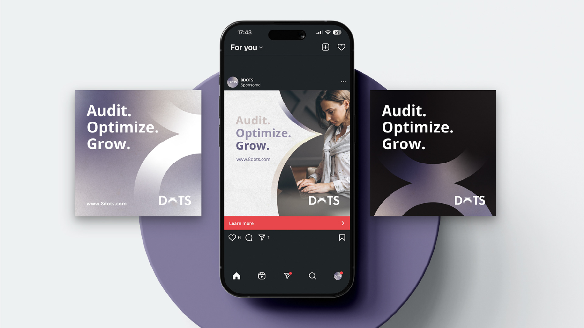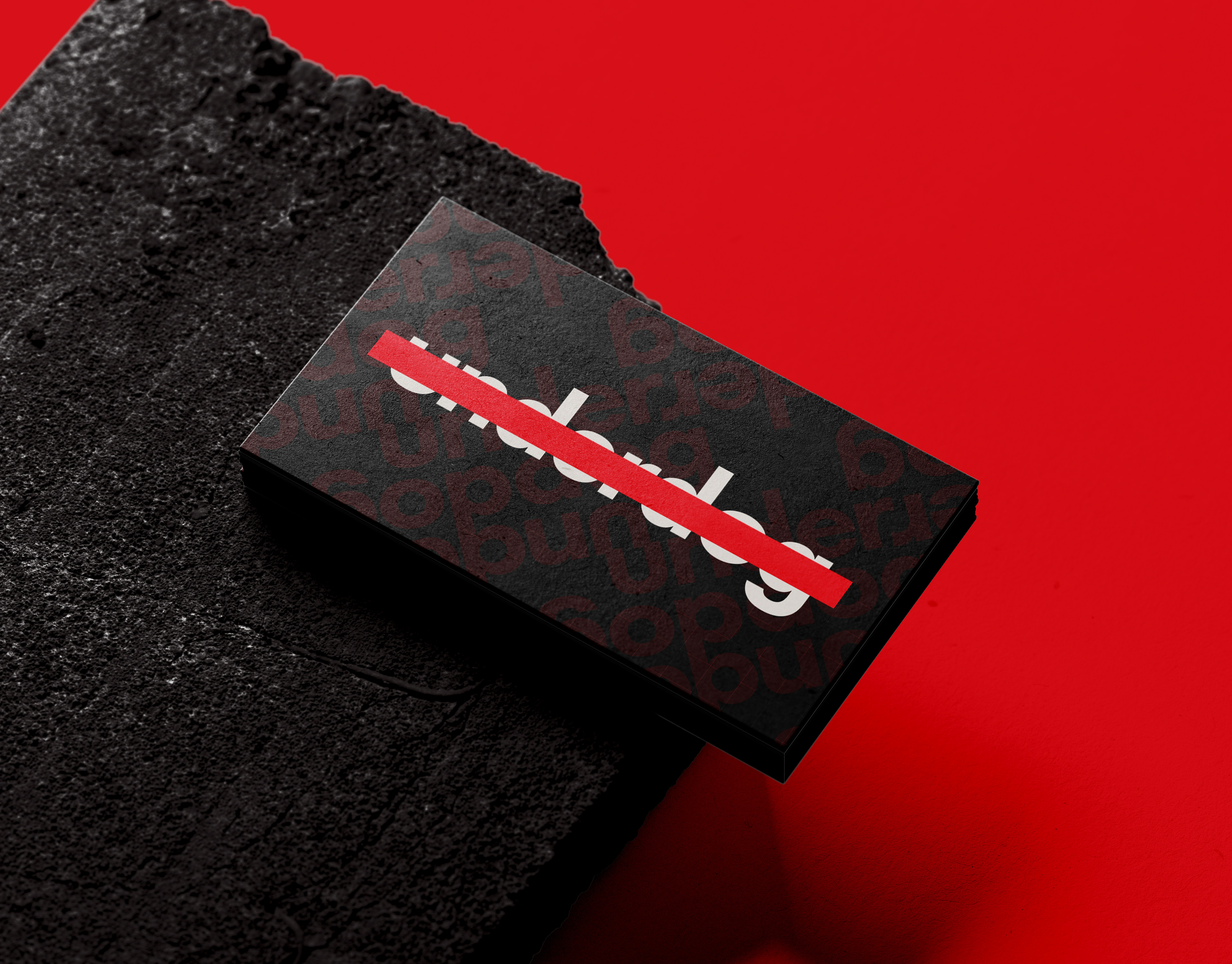
8DOTS
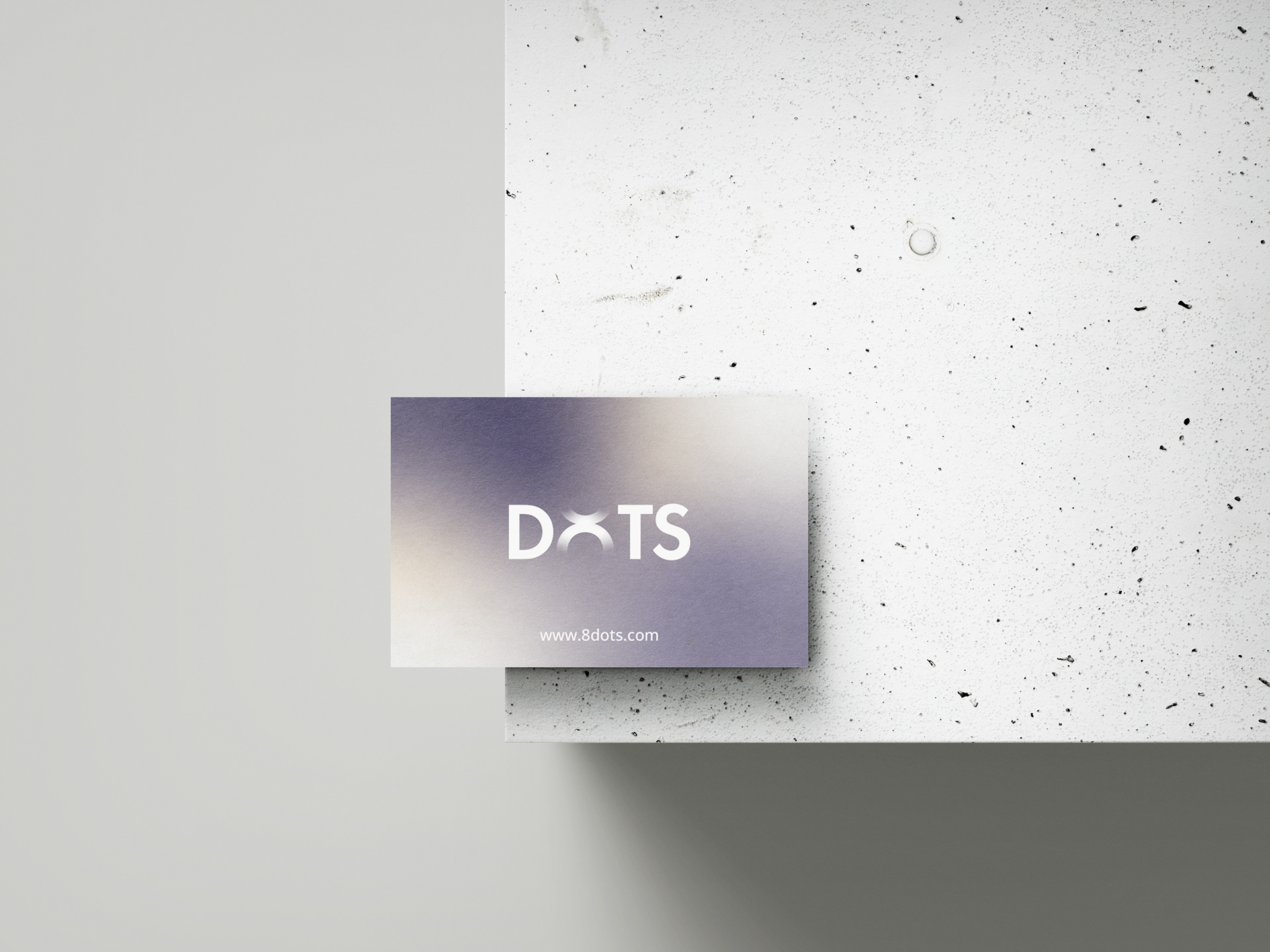
This project presents the brand identity for 8dots, a modern marketing agency built around the idea of connection and strategic alignment.
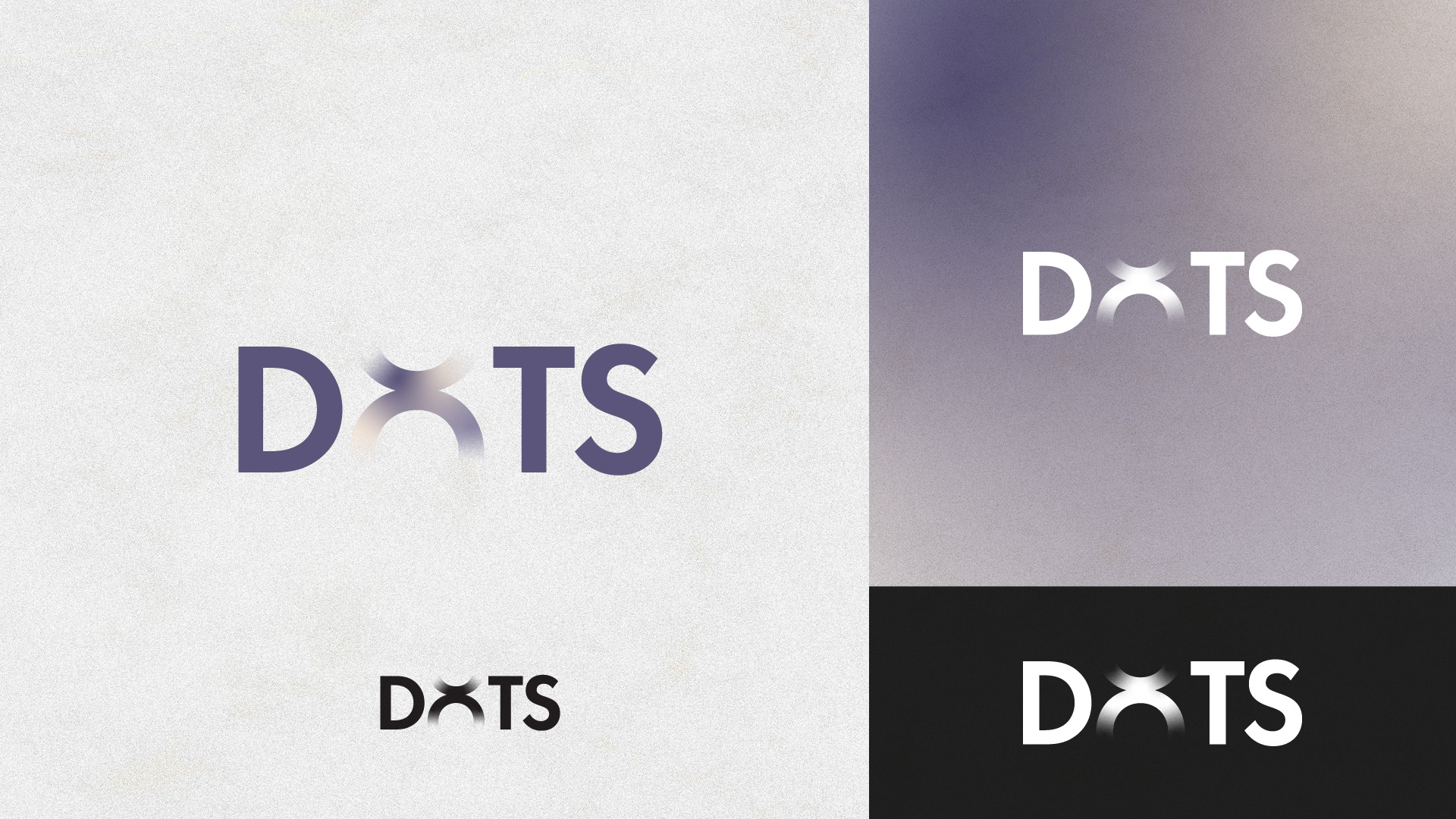
The core concept revolves around the transformation of the letter “O” into a custom symbol resembling an 8. The form is created by merging two perfect circular shapes into one continuous figure, symbolizing integration, flow, and the connection of multiple touchpoints — strategy, creativity, data, and storytelling — into one cohesive system.
The typography is based on Futura PT Demi, chosen for its geometric precision and contemporary character. The custom “8” aligns perfectly with the typeface’s baseline and cap height, ensuring structural consistency and visual balance across the wordmark.
A subtle gradient treatment within the symbol adds depth and motion, reinforcing the agency’s dynamic and forward-thinking nature.
A minimal yet meaningful identity designed to reflect clarity, connection, and confidence in marketing.