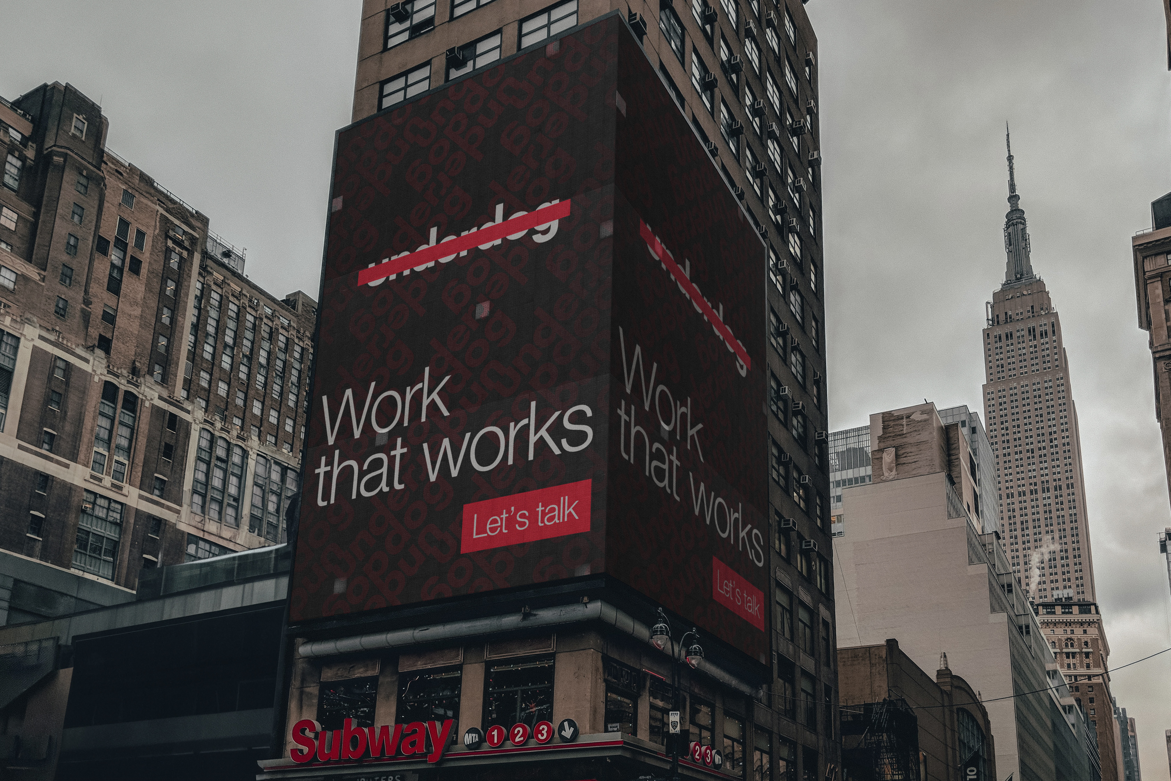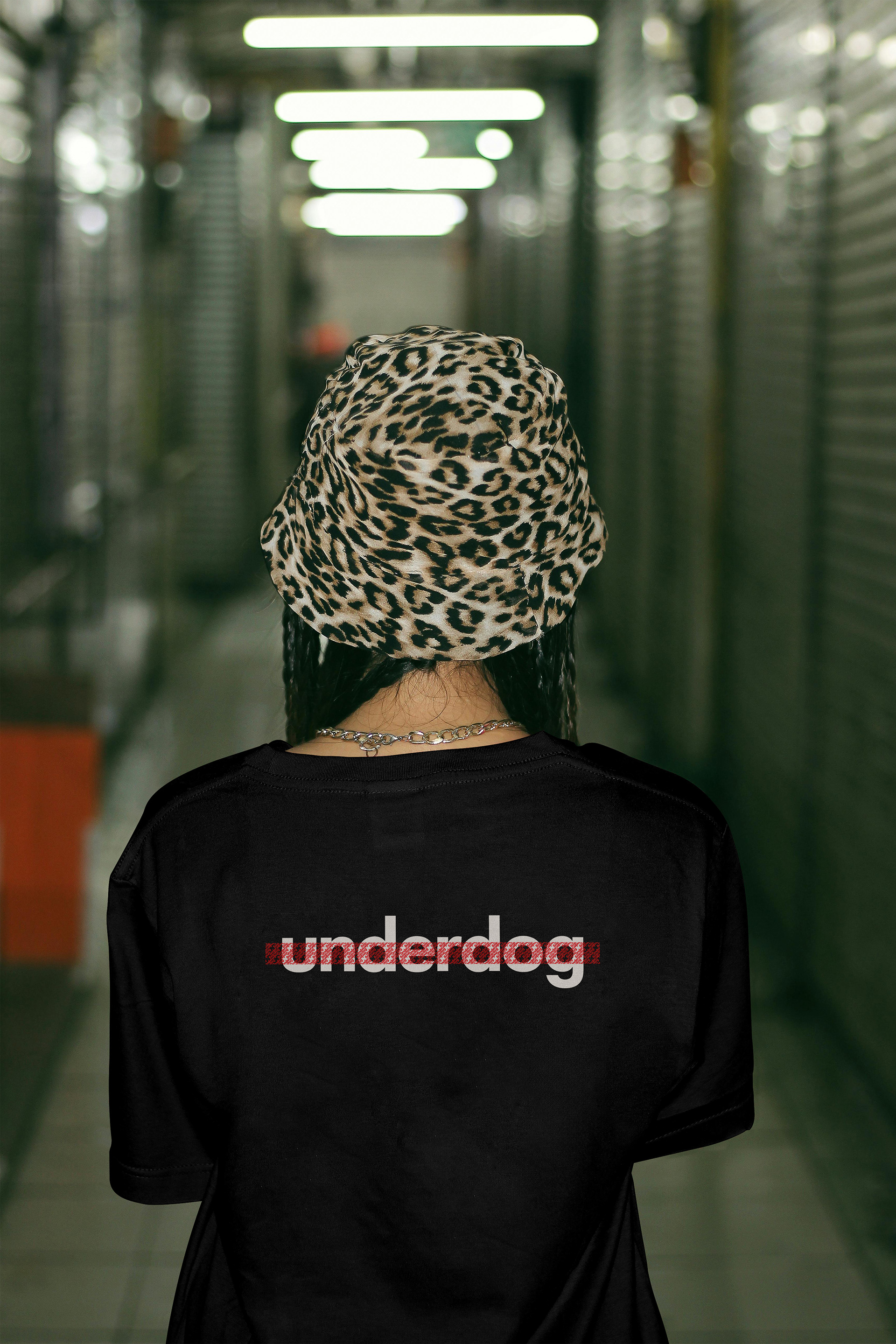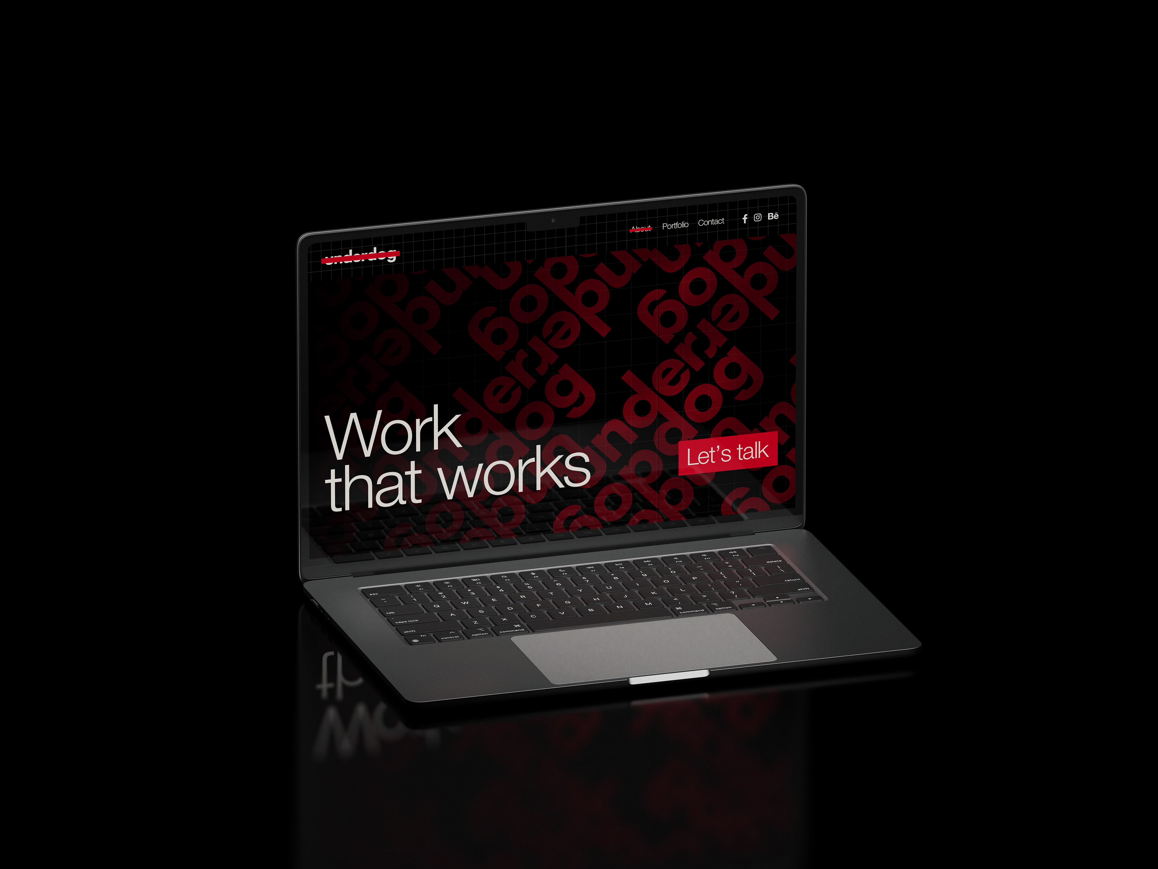
Underdog – Brand Identity Design for a Creative Studio
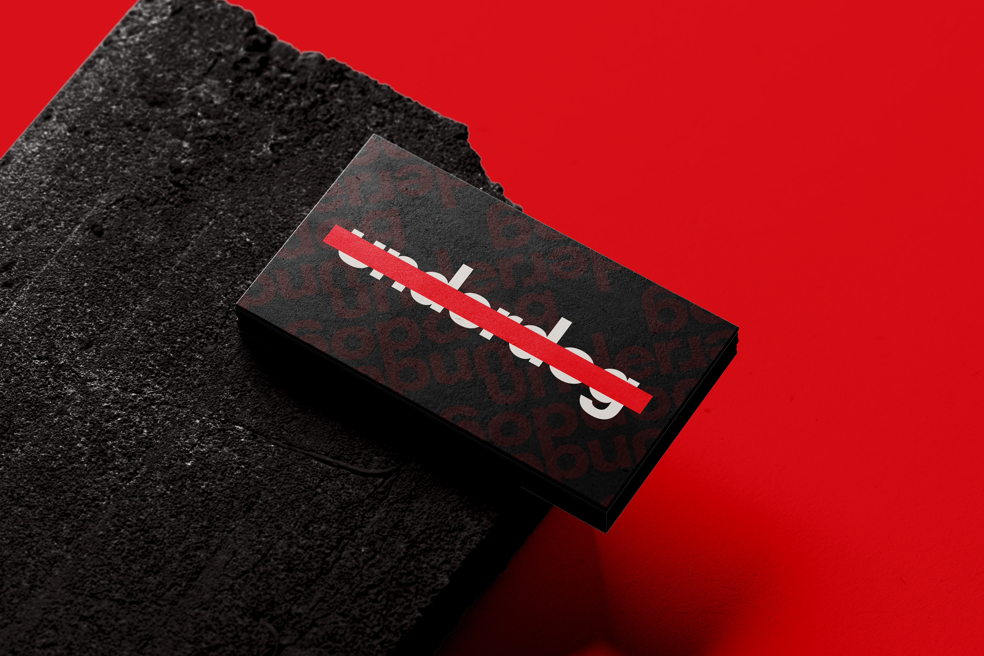
The underdog logo is a deliberate contradiction — a word meant to disappear, but impossible to ignore.
Inspired by Jean-Michel Basquiatʼs quote, “I cross out words so you will see them more; the fact that they are obscured makes you want to read them.ˮ and the radical visual language of Bülent Erkmenʼs “Equalˮ poster, this identity is about presence through resistance.
The red strikethrough doesnʼt censor the word — it underlines its defiance.
A clean, modern font evokes neutrality and clarity, but the disruption across it speaks to friction, persistence, and visibility through adversity. This is more than a name. Itʼs a stance.underdog is not hidden — itʼs highlighted by what tries to obscure it.